AWHERE

The identity for Awhere, a journal that celebrates a sustainable and adventurous lifestyle, started out with coming up with the perfect name. Combine ‘being aware of your impact on the world and the choices that come with it’ + a journal full of tips about where you can go, shop or travel = Awhere as a result.
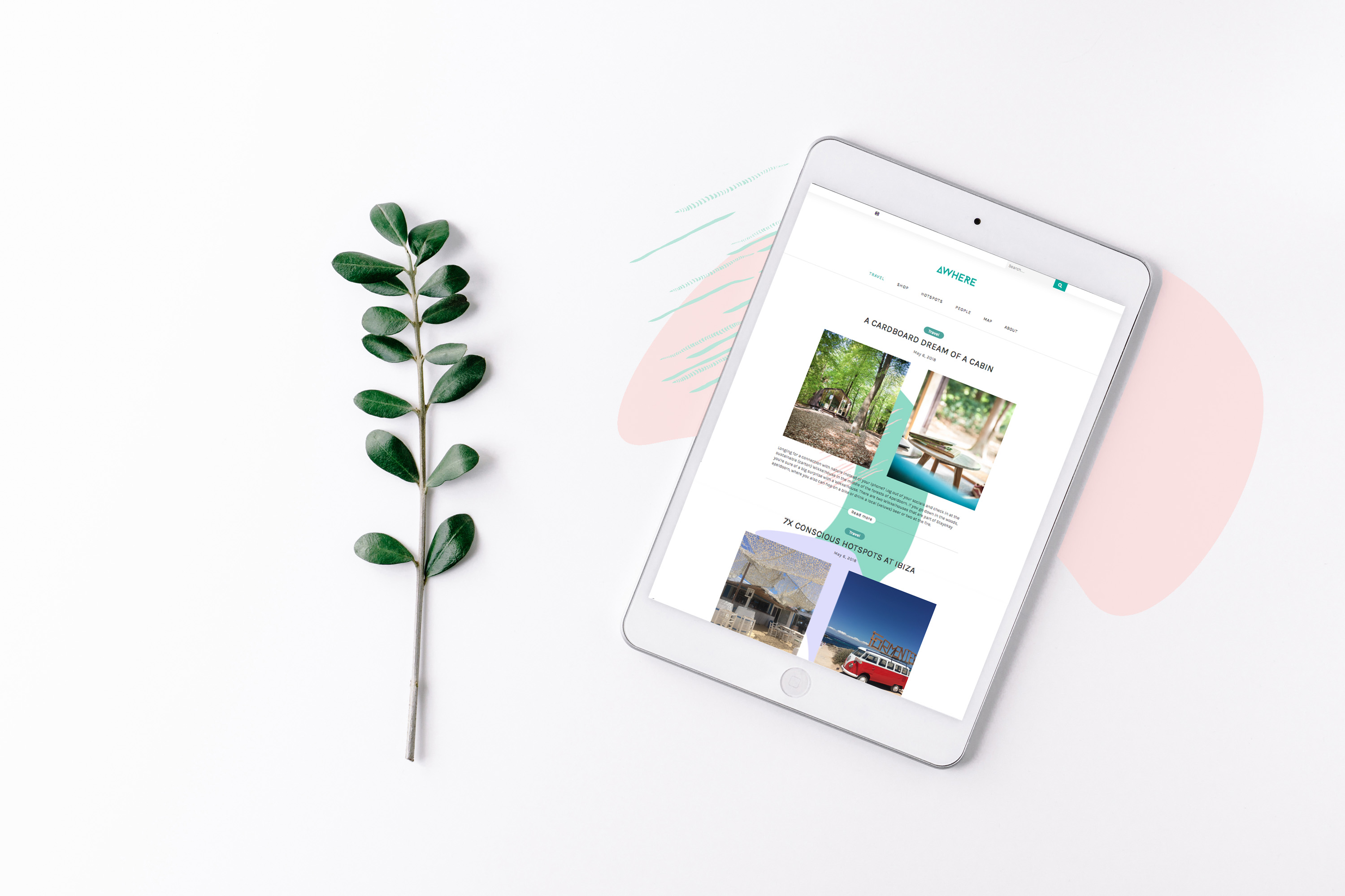
Awhere itself has as a simple pure typographic logo where the A without the typical crossbar in between looks like a tent and hints the inspiration from and for nature. This logo goes with a range of icons int he same pure style for categories like ‘travel, shop, hotspots and people’. In contradiction to the logo and symbols, I combined it with flowing, playful and colourful background patterns to keep it in balance and represent the adventurous spirit of Awhere.
Concept/Identity/Design/ Content (copy/photographs): Saskia kempers
Pattern design: Elke donders
Website: Below Enemy Lines